Navigation überspringen
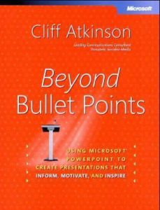
Beyond Bullet Points
Book

Beyond Bullet Points

Using Microsoft PowerPoint to Create Presentations That Inform, Motivate, and Inspire

Microsoft Press (USA), 2005 Mehr

automatisch generiertes Audio

Editorial Rating

8

Qualities

  • Innovative
  • Applicable

Recommendation

Microsoft PowerPoint changed the world of presentations by simplifying the process of creating a computerized slide show. Alas, over time people started squeezing too much information into every slide and using the preinstalled generic titles. PowerPoint's simplicity let people forget the purpose of presentations: to persuade or to inform without being boring. Cliff Atkinson shows you a creative way to build a good presentation without falling into the PowerPoint template trap – tell a story instead. At present, he provides a free template, storyboard formatter and story guide at sociablemedia.com that adds value to the book, which refers to these resources repeatedly. getAbstract recommends this to anyone who gives presentations.

Summary

Why You Should Shoot Down those Bullet Points

PowerPoint is an easy tool to use for presentations with bullet points, but such presentations tend to become boring, wordy and vague. To see if your presentation falls into this trap, ask yourself:

  1. "Can I see the focus of the presentation by reading only the slide titles?" – PowerPoint templates provide slide titles, but these labels, such as "Market Research," lack focus.
  2. "Does this presentation balance spoken words and projected visuals?" – Do notes appear in the Notes Page view? Speakers use this space to record what they plan to say while showing a slide. A blank Notes Page hints that the presenter crammed too much data onto the slides. Such an overloaded presentation relies on words with no visuals.
  3. "Will the slides look interesting to my audience?" – Look at each slide and assess how it affects the audience. While uniformity makes sense, repeating the same design throughout the presentation leaves little variety. Use fresh visuals for key points.

So how do you create a presentation that mixes visual images and lets you communicate...

About the Author

Cliff Atkinson, a consultant who helps organizations improve communications using PowerPoint, teaches at the UCLA Extension.


Comment on this summary or Diskussion beginnen

  • Avatar
  • Avatar
    M. J. 3 years ago
    very good information
  • Avatar
    A. 1 decade ago
    I make presentations for a living and have found this book quite helpful. The summary is a terrific refresher! Thanks!