Acesse a sua conta getAbstract para obter o resumo!

Acesse a sua conta getAbstract para obter o resumo!
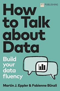
Martin Eppler and Fabienne Bünzli
How to Talk About Data
Build Your Data Fluency
FT Publishing, 2022
Sobre o que é?
Fear of data analysis affects the decisions you make – but you can become data-fluent.
Recommendation
If you want to do well in business, in medicine and in life, you need to be able to analyze data. Every day, data become increasingly important in dealing with the world, and using data incorrectly generates negative consequences. Academics Martin J. Eppler and Fabienne Bünzli demonstrate that people can learn “data fluency” – even those with moderate computer skills can learn to competently analyze and communicate about data. Data fluency will improve your decision-making, in business and in daily life.
Take-Aways
- People often fear data and statistics.
- Use basic statistics to communicate about data.
- Data patterns can model the world.
- “Complexity” helps you interpret data and navigate the business world.
- Data sets often contain systematic biases.
- You must visualize data to make sense of data.
- When bad news results from data, it can help promote change.
- Take intelligent steps to deal with conflicts over data.
- Stay aware of new trends in data analytics.
Summary
People often fear data and statistics.
Vast quantities of data are everywhere. In today’s workforce, whether you’re an executive, in human resources, a project manager, or in sales and marketing, you must make “evidence-based decisions” that you derive from data and the most up-to-date analytical techniques.
“We are not all highly data-literate or well-versed in sophisticated statistical procedures. Consequently, we may suffer from what we call analytics anxiety.”
For example, analytics anxiety might manifest as fear and discomfort over data acquisition, analysis and communication to colleagues. Analytics anxiety affects the quality of a person’s decision-making. It also affects that person’s ability to collaborate. Individuals with analytics anxiety are more likely to avoid complicated data, and to be misled by biased data or evidence that lacks precision and rigor.
A variety of factors – including lack of statistical understanding, fear of data quality, uncertainty that data provide an adequate justification for decisions, and “data fatigue” (reviewing too much data over a given period) – can cause analytics anxiety. You can deal with analytics anxiety in different ways, depending on whether you make decisions or present data.
People making decisions may need to improve their knowledge of data analytics and statistics. They might consult younger employees who understand analytics, request that their reports provide data to them in a form they recognize, and be willing to admit when they don’t comprehend a data set or an analytical technique. Presenters should inform themselves about the kind of errors data scientists make. They should focus on effective visualization designs, combine numerical presentations with knowledge visualizations, and tell compelling stories with their data.
Use basic statistics to communicate about data.
As the world grows increasingly complex, sometimes experienced leaders don’t recognize changes taking place right under their noses. Any significant judgment error can lead to disaster for an organization. Statistics introduces objectivity into the evidence-based decision-making process.
“Statistics is the key to make your data speak. Statistics allows you to decipher your data and discover the story they tell.”
Statistics analyzes data using quantities, which variables articulate. Variables can be either “categorical” (representing a category, such as a job or a project) or “continuous” (depicting a meaningful difference in value between data points). You can break down both variables into more precise units. You can express a larger picture of a data set through a “frequency distribution,” which shows how each data value is located in the data set as a whole. The standard frequency distribution is continuous and symmetrical. Others are nonsymmetrical and tilt in one direction or another, or with abrupt spikes. Through these concepts, you can establish a data set’s “mean” – although nonsymmetrical data sets can distort the mean.
When you’re undertaking statistical analysis, consider what sort of data you have and whether it’s amenable to statistical analysis. Determine the level of precision used to establish the variables, and whether unusual extremes exist in the data’s distribution. Present your data in a simple, straightforward and clear manner.
Data patterns can model the world.
From a business perspective, a manager might want to know whether a relationship exists between, for example, the weather, the number of hours of sunlight per day, and the number of customers at his or her restaurant. Knowing those phenomena correlate can shape a manager’s decisions.
“Be aware that just because two things appear to be connected doesn’t necessarily mean that there is a cause-and-effect relationship.”
Some statistics deal only with a single variable at a time, or “univariate data.” If you want to understand the relationship between two otherwise independent variables – the weather and restaurant attendance, for example – you need “bivariate data”: an examination of the relationship between at least two variables.
The standard relationship is linear, or a “straight-line relationship.” Address this through a “scatter diagram,” in which you plot the data along an X and Y axis. The correlation is positive when the line ascends the X and Y axis. The correlation is negative if the line descends. Scatter diagrams show a mathematical relationship between variables, not a causal one. To make predictions, you need to show that one variable influences the other. For that, you need more data and mathematics – in particular, a “linear regression model,” in which linear equations predict one data point following another along the positive progression.
“Complexity” helps you interpret data and navigate the business world.
Business managers or leaders must analyze complex relationships. Such relationships occur when one thing shapes the connection between two other things, or when a third thing shapes the relationship between two things. A statistical approach to the former is “moderation analysis,” and to the latter, “mediation analysis.”
“Moderation and mediation both enable us to better understand the relationship between a predictor and an outcome by testing how a third variable fits into this relationship.”
For example, how would you investigate the relationship between a person’s involvement in a human rights group and that person’s willingness to give money? There might be a strong correlation between personal involvement in the cause and donation levels. Then, add a variable to the scenario, gender. With gender as a “moderator variable,” involvement only leads to greater donations if the person’s gender is female. The greater a woman’s involvement, the more donations she provides. In this example, the moderator variable makes the relationship between predicted behavior and what happens stronger.
Mediation, conversely, uses a third variable to explain a relationship between predicted outcomes and what actually happens. For instance, suppose your human resources team wants to understand why the more holidays your employees take, the better they perform. As it turns out, the perception that the employee balances work and life explains the relationship between holidays and job performance.
Data sets often contain systematic biases.
Data often make people feel more secure and confident. When they lack personal experience, people may feel more confident in their decisions when they have data to hand. But data can suffer from biases at every level: acquisition, analysis, data transmission and use.
“The good news is that you can cultivate a healthy skepticism against data biases: You can detect or even prevent such distortions.”
Data biases come in multiple forms. They can come from how people tend to collect data that is easily available, and when the selected data confirm previously existing biases. Biases in data analysis can arise from confusing variables, making unfounded associations between variables, ignoring data at the margins, assuming the data fit the normal pattern, and through manipulating models to make them fit the data. Biases in data transmission and use often occur when the analysts fail to communicate their data clearly to nonspecialists, managers who overestimate their understanding of statistics, and people who conflate correlations with causes.
To avoid data bias and distortion, ensure that your data collection is transparent, that your analysis takes into consideration alternate points of view and unusual data points, and that your audience understands the data and analysis you are preparing.
You must visualize data to make sense of data.
Given the predominant importance of data, just about everyone has a stake in learning how to communicate data clearly and effectively. At this point, however, people live in a world that has data streaming in from every direction. To improve the communication of data in this crowded world, you must turn to a visual format. Data visualization has six core principles.
- “Declutter” – In a chart, decluttering requires eliminating anything that draws the eye away from the data you’re conveying.
- “Emphasize” – You should somehow visually underscore the core data in a chart. For example, you can do this with a different color.
- “Storify” – Present your data visually in a sequence that tells a story. This adds emotion that involves the viewer in the data.
- “Involve” – Increase people’s involvement in data by making the chart interactive to engage your audience. Never simply present data to an audience. Involve them interactively as part of a dialogue.
- “Give meaning” – Data should be significant to your audience. When data are interactive and connect to something a user can do, that data can be more compelling and meaningful. Contrast numbers with something the audience is already familiar with.
- “No distortions” – Avoid visual formats that might foment misunderstanding the data or make the data misleading.
When bad news results from data, it can help promote change.
The product of data isn’t invariably good news. Sometimes, after you collect and analyze your data, the results you must convey do not match your expectations. “Negative trends” involve developments you don’t want, such as reduced demand for your product. “Goal failure” means you failed to reach your aims, such as acquiring a certain number of new clients. “Insufficient competitiveness” suggests you are falling behind your competitors.
“Although bad data-based news is something from which we might intuitively shy away, there is great potential to it. When communicated in a clever and compelling way, bad data news can be a (positive!) game changer.”
Absorbing bad data-based news goes through three stages: first, “comprehension,” in which the audience understands the nature of the data-based news. The second stage is “acceptance,” in which the audience abides the negative news and its implications. In the third stage, “motivation,” the audience uses the bad news as an inspiration to move forward and improve. In all three stages, the person conveying the news enables the audience to move through the stages and, ultimately, toward a positive outcome. The person conveying negative news must communicate with clarity and concision.
Take intelligent steps to deal with conflicts over data.
Issues with data and data analysis aren’t always straightforward. The quality, analysis and ultimate use of data may not be clear-cut. To maximize data’s value, combine different points of view on data quality, analysis, interpretation and application. Combine a more technical perspective with a business management perspective.
“If you want to get the full value from data, you should not shy away from dissensus around it, but embrace good fights. In such debates, the common goal should be to come to a higher level of understanding of the data.”
People need to argue about data productively. They should do so in constructive dialogues, not shouting matches. Structure data debates around four steps. Frame the discussion in a positive light, inviting more points of view and experiences. Clarify points of contention or disagreement. Visualize the disagreement using whiteboards or other tools, so everyone can understand areas of dispute and consensus. Focus active criticism on the visualization rather than on people’s opinions, and validate minority views. Conclude discussions with a positive joint perspective that incorporates a nuanced view of the data.
Stay aware of new trends in data analytics.
Data analytics is never static. Emerging trends, such as a more transparent version of AI, and quantum computing, will shape the field. Never regard your data fluency as complete. Continue learning as the field evolves.
About the Authors
Chair of communications management at the School of Management Martin J. Eppler is vice rector of the University of St. Gallen, where Fabienne Bünzli is a lecturer.
This document is restricted to personal use only.


Comment on this summary